


Under The Clouds: Act 1, Chapter 1, Scene 2b

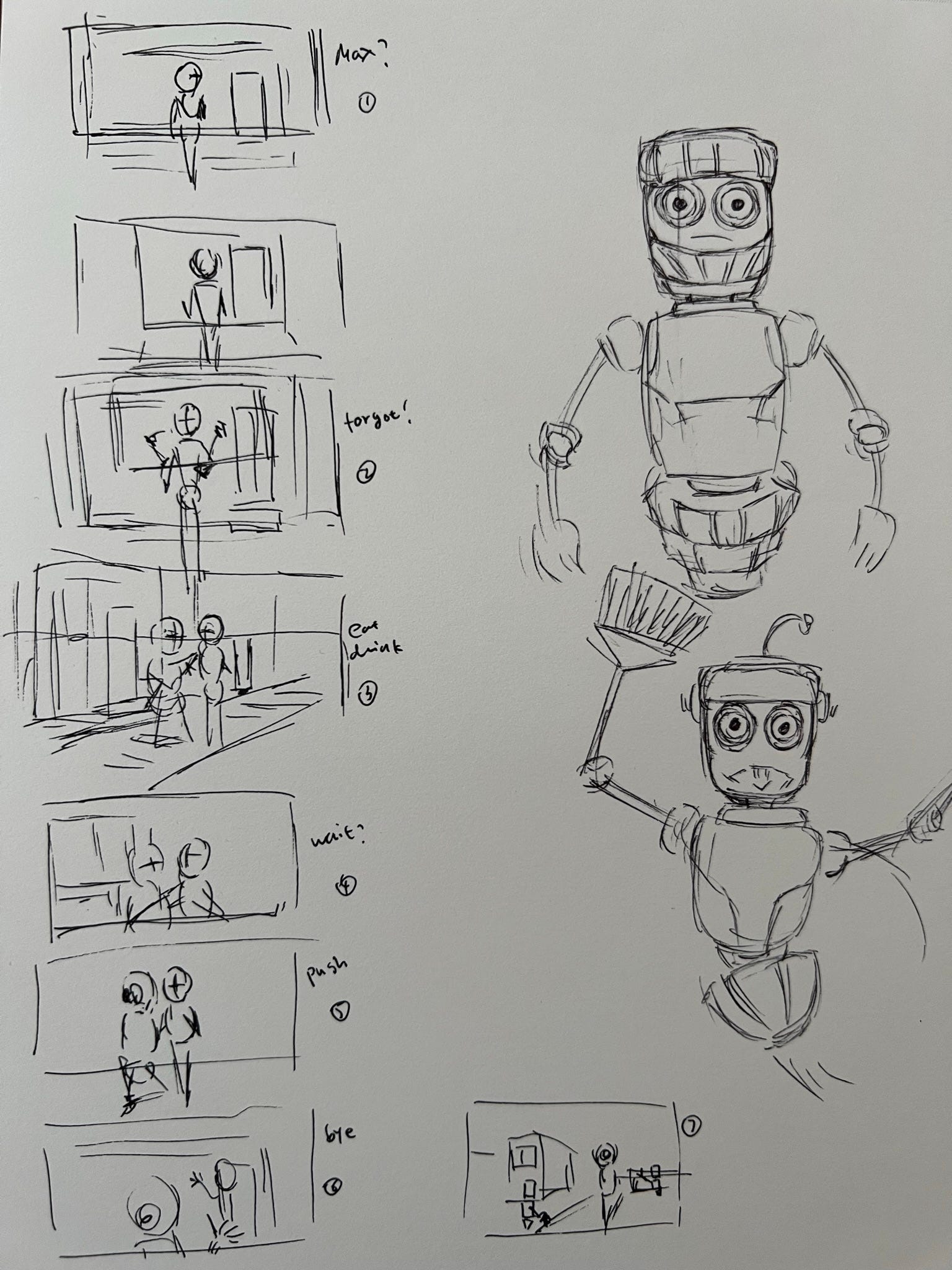
How to draw is one thing and how to stage a drawing is another. How should I deliver a message or information through a series of still images? At what camera angle? How far or close should the subject matter be focused? Scene 2 isn’t complex but not as simple as a bird flying through the sky and landing on a mailbox. To organize the necessary imagery needed to be shown for scene 2, I pull out a pen and drew little thumbnails, a minimalistic mini-me type of little sketches that roughly showcase my future to-do’s.
I miss sketching. The other day when I was going through my old things, I found a folder containing a few of my sketch drawings.
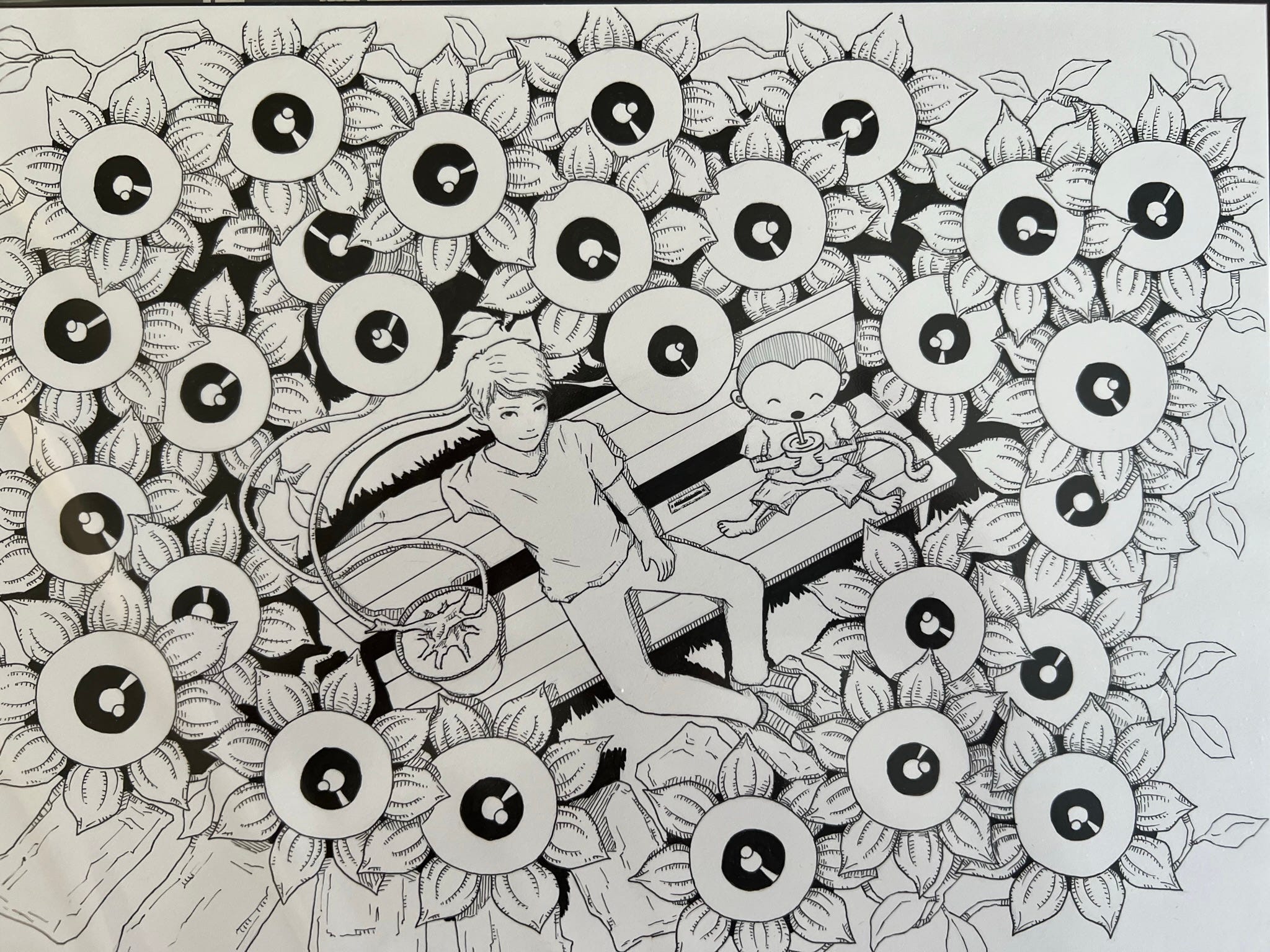
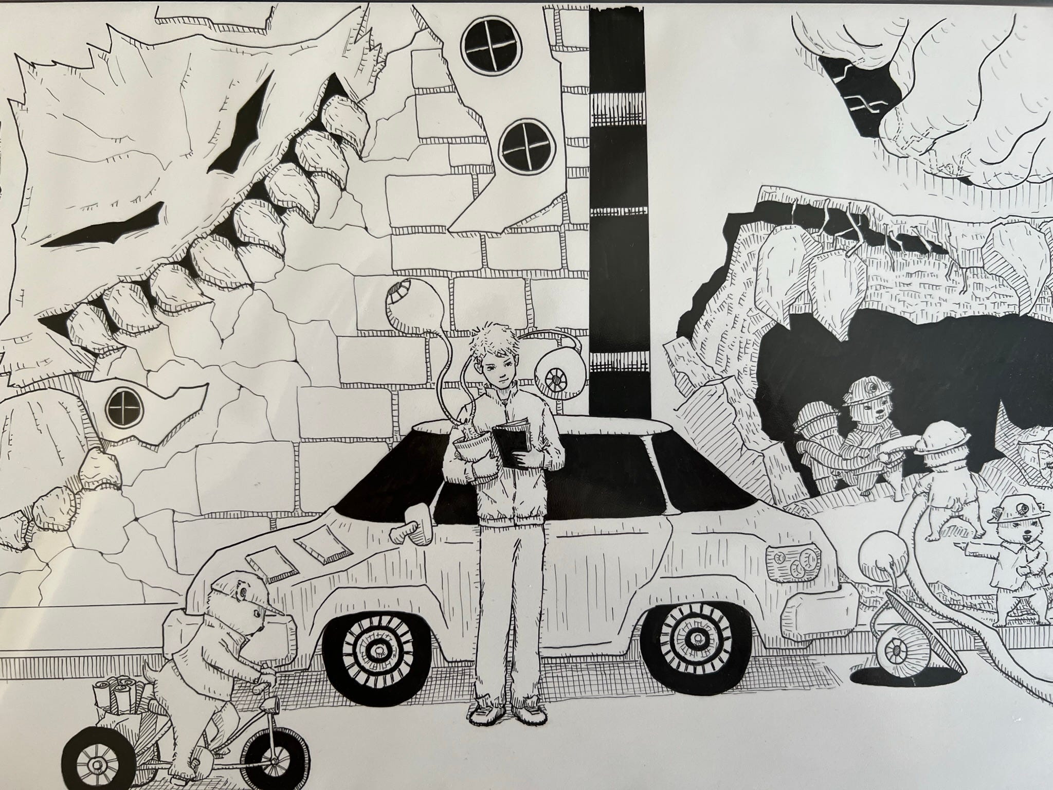
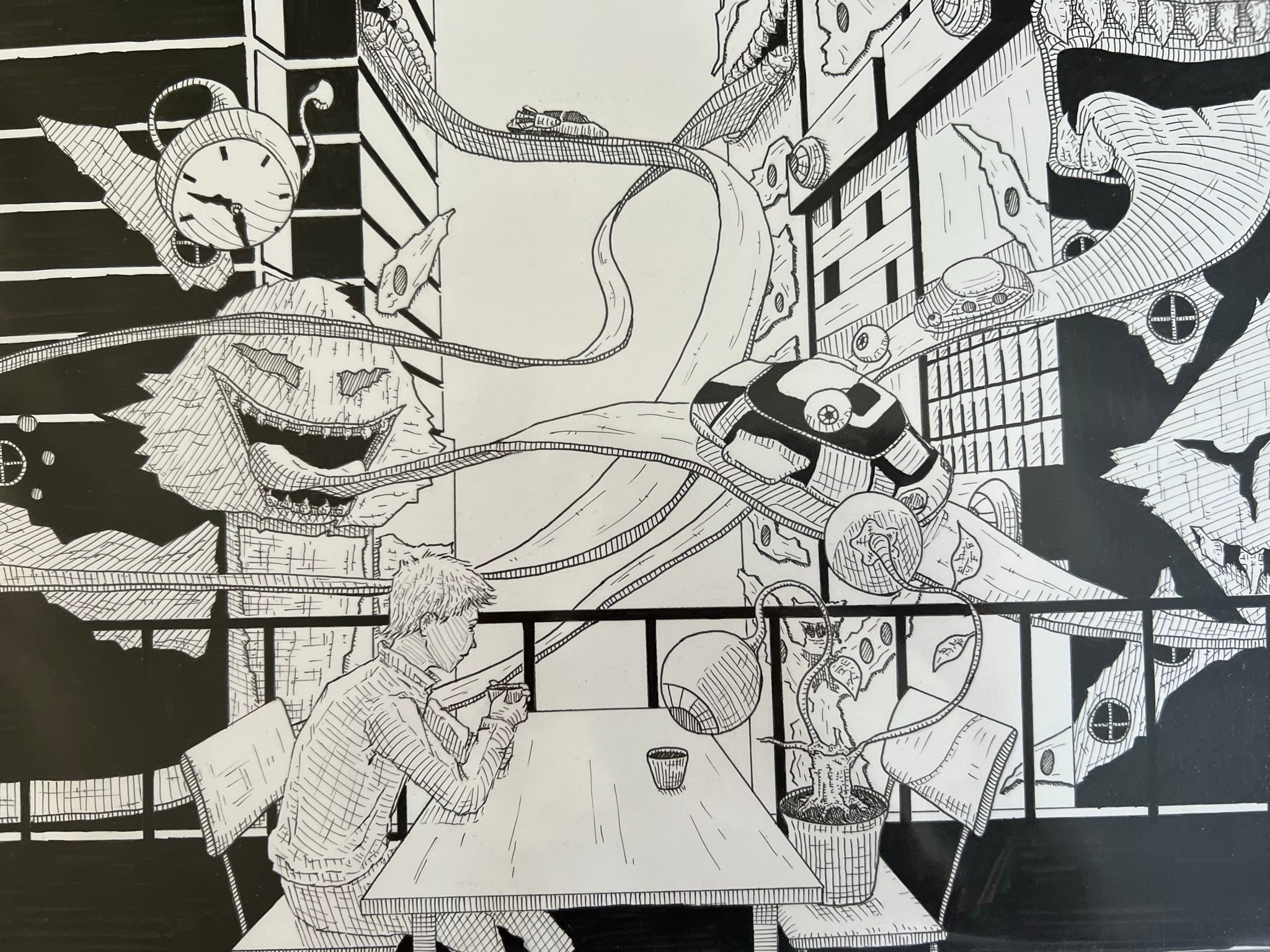
I have to resume sketching at some point. I really do miss obsessively drawing eye ball plants and gaped mouth with sharp teeth and bunny ornament structures. Ink is my medium. I tried water color and the feel of fluidity was not satisfying. I like the solidity, a stroke of an ink pen can deliver as well as the look of black and white on paper.
Anyways, back to Under The Clouds.

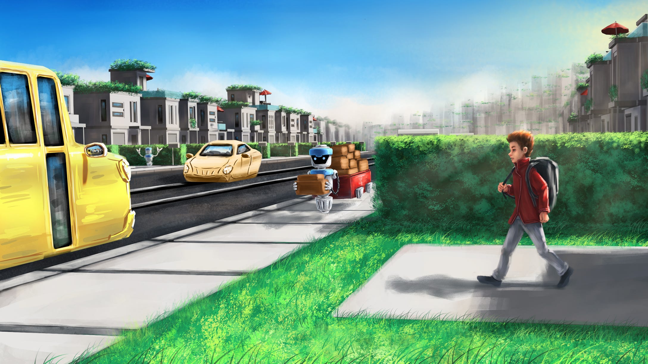
As much as I want to draw faster, I think 2 drawings per week is as much as I can do. I spent the entire Sunday drawing the above despite having the help of a Blender rendered image for the layouts of inanimate things. As I go further with the graphic novel, things can only expand. There will be more actors, more things, or more unique subject matters to be rendered or detailed in a scene.
I have really tried to make my drawings atmospheric. I have used tricks and tips that I can think of to mimic moody drawings by other artists that I liked to visually enhance my own drawings. I still feel like they are somewhat lacking or not there yet. Making atmospheric drawings have been my goal since I started digital painting.
I watched Skull the other day. It was a pre-sequel to the Predator vs. Prey movie series. I am not sure how much green screen it used but atmospheric, whether it was digitally composed or naturally shot, is what I would say about the visuals of the movie. It was beautifully shot. What I liked the most about the movie was how color tones and atmospheres distinctively changed as the story progressed from one scene to another. It sometimes came back to a set of familiar visual tones when a scene shared a similar plot to an earlier scene. It’s not common to see a such color coded live action movie since environment constantly changes around us and it’s impossible to stop time to repeat a shot. Even CGI has it’s limitations to be consistent. It was refreshing to see a movie that utilized environment as a crucial visual supplement in telling a story.
Such color coded representation is something I should adopt into my graphic novels. Along with dynamic staging, soothing atmospheric visuals is always top of my mind when start a drawing. Of course I also should not forget to pace images and place visual clues well when sequencing drawings into a chapter. It is an exciting and tiresome process that I enjoy encompass myself with.
I am planning 3 drawings before next week’s post. 2 of them will be solo close-ups of characters that the graphic novel will first introduce. Since they are semi portraits, they won’t take up much time to complete.
That’s for all for the week and thank you for reading and stay healthy and see you next time.